To get to Socrates Sculpture Park in Astoria, Queens, you first have to know that it’s there, and then you have a fifteen-minute hike from the nearest subway station, but it’s worth it. Created in the mid-80s by local artists and activists out of a rubbish dump on the banks of the East River, Socrates is the only outdoor space in New York City dedicated to providing artists with the space and funding to create large-scale, interactive sculpture and installations. It’s also an active local park, with a farmer’s market on Saturdays, yoga classes, and a summer outdoor movie program, and plenty of visitors come here just to picnic and cool off in the breeze from the river, encountering the art accidentally, haphazardly.
This summer there are four exhibitions in the park. The first as you come in the tall orange gates is Heather Rowe’s Beyond the Hedges (Slivered Gazebo), a group of angular hacked-up trellises, mirrors, and planks of plywood, that distort perspective, reflecting a square of grass in the sky or a triangular slice of river in the warehouses opposite the park. Chitra Ganesh’s Her Nuclear Waters is a scene from an apocalyptic comic, blown up to billboard size above the entrance to the park, a wink back at the urban wasteland on the water that the park used to be.
The main installation, do it (outside), curated by Hans Ulrich Obrist, is a version of the do it exhibition that has been shown at some fifty venues in the past twenty years, each one a site-specific reinterpretation of the basic concept of displaying artists’ instructions alongside ‘realizations’ of their work. The instructions range from the tiny and gnomic (Shimabuku: ‘Make some art works for animals. And make them smile.’) to the elaborately diagrammed and painstakingly documented, and include plenty of blockbuster names—Tracey Emin, Ai Weiwei, Sol LeWitt. But because the exhibition playfully upsets the correlation between idea and execution, between artist and artwork, it makes the whole concept of artistic fame feel suspect—born out in Michael Smith’s How to Curate your own Group Exhibition, which begins ‘On a piece of paper, write the names of three famous artists. Add your name to the list. Make up a title and write a press release.’
All the instructions are printed in plain black type on white translucent weatherproof canvases, like carefully egalitarian gallery wall texts, and arranged market-like as a series of canvas-roofed tunnels. Ai Weiwei’s CCTV Spray is one of several to include diagrams, and the instructions here—for mounting spray paint cans to extendable poles in order to block CCTV cameras—look more orderly than their ungainly realisations.
Other ‘realizations’ twist the instructions to fit the space in a way that cleverly transforms their intentions and effect. Alison Knowles’s Homage to Each Red Thing involves dividing the gallery floor into squares of any size and placing a red object (‘a piece of fruit,’ ‘a doll with a red hat,’ or ‘a shoe’) into each square. Here at the centre of the exhibition, the red things are lounge chairs and patio umbrellas, making the space double as gallery and picnic spot. Other reproductions are more faithful, like the realisation of Sol LeWitt’s instruction ‘A black not straight line is drawn at approximately the center of the wall horizontally from side to side. Alternate yellow and blue lines are drawn above and below the black line to the top and bottom of the wall.’ Yet here again the space intervenes, so that a painting that might have dominated a closed gallery is dwarfed by open space, trees and sky, making it feel like a building block rather than a wall. Other realisations make use of the outdoor space deliberately, working with its possibilities—as in the interplay of light and space and mirrors that almost brings to life Darren Bader’s impossible instruction to ‘Glue a [rectangular] table to the sky [table top up, somewhere not too close to the sky’s zenith].’
The final installation in the park this summer is Toshiro Oki Architect’s ‘tree wood,’ winner of the annual ‘Folly’ competition, named after the small-scale, basically useless ornamental building that eighteenth-century landscape designers used to frame a view or guide the eye. The contest invites designers and architects to reimagine the folly for a modern environment, to build something ambitious, intriguing, and pointless—here, a gaudy crystal chandelier inside a suspended wooden cage. The chandelier is just high enough, and just camouflaged enough by branches, to be a surprise when people catch sight of it, and giggle, and climb into the cage to take pictures. Which is just what you want from a folly.
Joanna Scutts
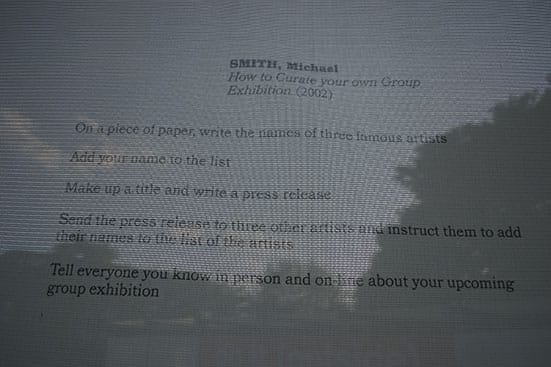
Michael Smith How to Curate your own Group Exhibition Socrates Park (Photo J. Scutts)
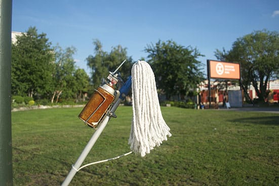
Ai Weiwei CCTV Spray Socrates Park (Photo J. Scutts)
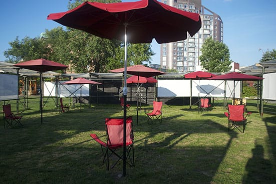
Alison Knowles Homage to Each Red Thing Socrates Park (Photo J. Scutts)
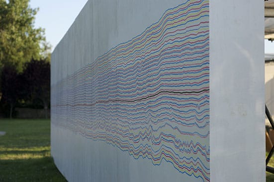
Sol LeWitt ‘A black not straight line is drawn at approximately the center of the wall horizontally from side to side. Alternate yellow and blue lines are drawn above and below the black line to the top and bottom of the wall.’ Socrates Park (Photo J. Scutts)
![Four Exhibitions at Socrates Sculpture Park, New York —
Darren Bader ‘Glue a [rectangular] table to the sky [table top up, somewhere not too close to the sky’s zenith].’ Socrates Park (Photo J. Scutts)
Four Exhibitions at Socrates Sculpture Park, New York —
Darren Bader ‘Glue a [rectangular] table to the sky [table top up, somewhere not too close to the sky’s zenith].’ Socrates Park (Photo J. Scutts)](/content/images/64/socrates-5-darren-bader-realiz.jpg)
Darren Bader ‘Glue a [rectangular] table to the sky [table top up, somewhere not too close to the sky’s zenith].’ Socrates Park (Photo J. Scutts)
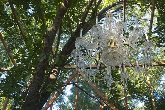
Toshiro Oki Architect ‘tree wood’ Socrates Park (Photo J. Scutts)